"Torpedo" management responded to criticism of the club's new logo
August 5, 2025 20:02
[439]
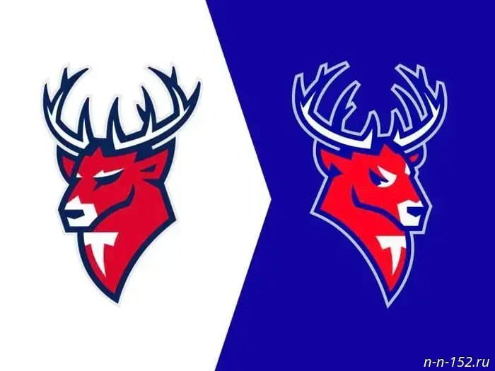
Sports The Chairman of the Board of ANO HC "Torpedo" Maxim Gafurov and the club's General Director Yevgeny Zabuha responded to fans' outrage regarding the rebranding of the "Torpedo" logo. They spoke live on August 4.
It is now remembered that the stag looks to the right instead of to the left. The ears and eyes have also been redesigned, and the background color has become blue.
Gafurov noted that such changes are rarely accepted positively immediately. Additionally, he said that this is not a "new logo," but merely a rebranding of an existing stag.
The popular "T" letter used on the jerseys of the farm team "Torpedo-Gorky" will also be altered to resemble a stag. This likely refers to the emblem presented in the brand book.
This logo will adorn Torpedo's pre-season kit, which Nizhny Novgorod players will wear in the Moscow Mayor's Cup.
It was previously reported that the new Ice Arena on Strelka will be named without reference to the main sponsor of Nizhny Novgorod's "Torpedo."
NIА "Nizhny Novgorod" has a Telegram channel. Subscribe to stay updated on major events, exclusive materials, and timely information.
Copyright © 1999–2025 NIA "Nizhny Novgorod". When reproducing, a hyperlink to NIA "Nizhny Novgorod" is mandatory. This resource may contain 18+ materials.

Другие Новости Нижнего (Н-Н-152)
 Nizhny Novgorod residents spent 6,500 rubles on medication in 2025.
 Former Nizhny Novgorod official Bortnikov placed under house arrest
 Nizhny Novgorod Region selected the best municipalities for 2024
 The construction of the bypass road near Sennaya Square was estimated at 76 million rubles.
 The chatbot has been launched for passengers of the Nizhny Novgorod cable car.
